- Access to the internet
- Something to take images on (camera or a phone)
- Somewhere to add notes about the images (notebook or digital file)
1
Introduction
This lesson is about recording all your current wall spaces and beginning to think about them in relation to all of the research you have just done about wallpaper. This could include spaces you have access to such as; the family home, workspaces, or spaces whose owners are looking for someone to refresh them.
Equipment
Guiding Questions
Think about these questions as you work your way through the lesson:
Lesson Content
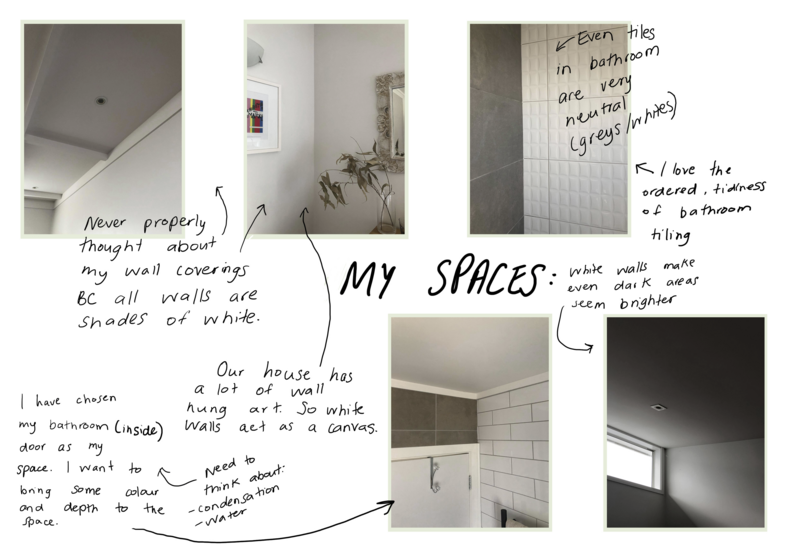
Today you are going to slow down and take a critical look at all of your walls. Examine your walls carefully and think about how they affect the spaces you are in. Do you have white walls that make the space clean, bright and seem larger? Is there a ‘feature wall’ that demands the attention of everyone in that room? Do you have tiles that help to protect the walls from moisture and mess? What about your digital wallpapers? And your exterior walls?
If you are reading this during the 2020 national lockdown you are limited to your bubble, if not then think about investigating wall spaces other than in your home.
Keep in mind: design has the power to make tangible change to our lives. So, which spaces need a change and what should guide that change? Light? Joy? Colour? Whanau? Information?

Anjuli's space analysis
Let's do something!
Take your camera and photograph all of the walls in your home. If you have access to other spaces such as; workplaces, the family home, community spaces, then repeat the process there as well.
Note: this is a documentation exercise - try not to get hung up on getting ‘arty’ shots. However, we have added some tutorials and links to help if you want to build those skills. Check the bottom of this lesson.
Your photos should:

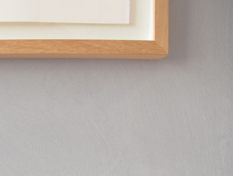
Close up shot of my blue/grey textured feature wall; blehk
Take all of your images off of your device and store them somewhere sensible. That is, somewhere that is automatically backed up. At the risk of telling you to suck eggs we suggest you use an online platform such as Google Drive to store and back up all of your work.
Perhaps something like this:
Google Drive>Wallpaper Project>existing walls_pics

Suggested folder structure
Use the guiding questions at the top of the lesson to do a quick analysis of your wall spaces. Basically, you need to look at the space as it exists and ask yourself how COULD it look if you created a wallpaper for it. This is where you realise if you have an expanded definition of wallpaper. For example, did you photograph your bathroom walls? Are they tiled? Why CAN'T you design custom tiles? Just saying ...
Remember:

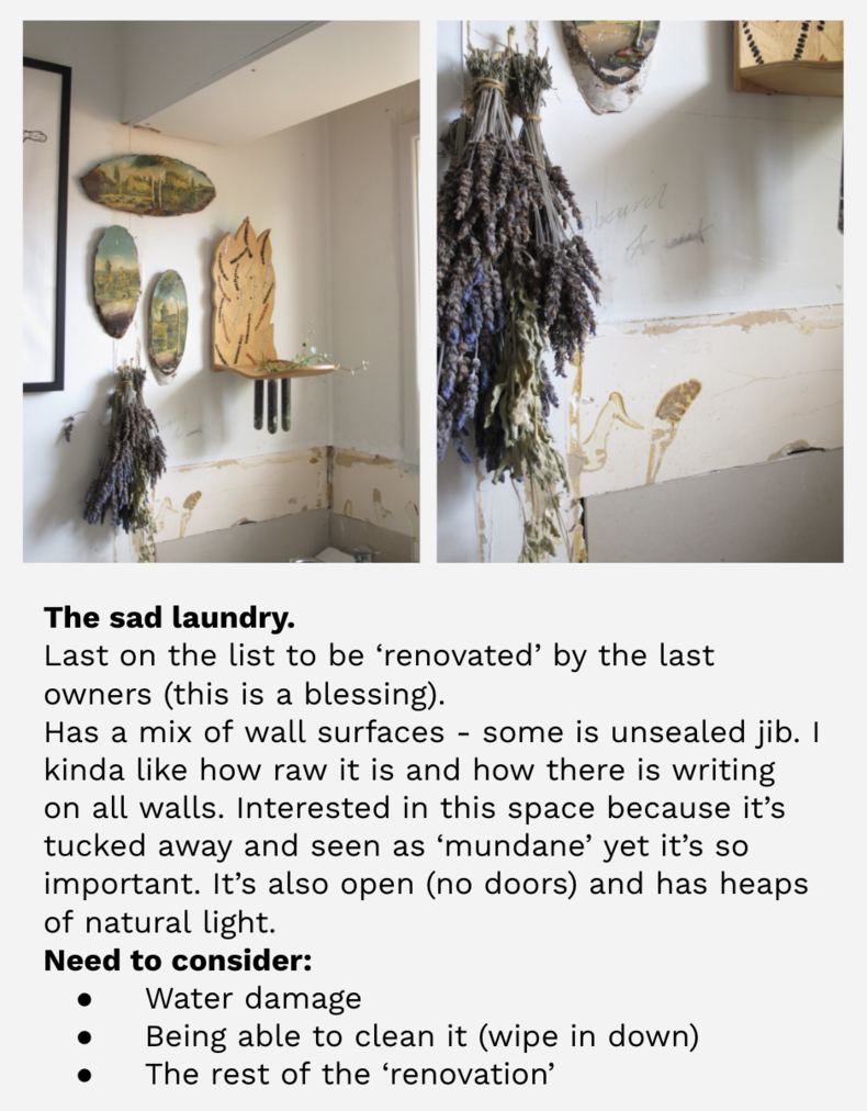
Laundry walls reflection
Now - which space/s are you wanting to design wallpaper for? Note: this could (and probably will) change as your ideas develop. But we need somewhere to start. Write a short guiding statement to help clarify your thinking. It doesn't have to be fancy - keep it simple and to the point.
Demelza's example:
I am going to use the walls in my laundry as the ‘specific space’ to design my wallpaper for. The laundry is the only room to have escaped the renovations made to my house by the previous owners. I blame them for the current textured feature walls, the most disturbing golden matric wallpaper ever designed and shiny brown/gold tiles in the kitchen. While I dislike the choices made before me, I’m not about to make major modifications because I won’t be here for too long. So, whatever I do is with the view that I could take this design with me to my next place, while still giving some life to an unloved space.
The laundry is like a blank canvas - it still has writing on the walls/the surfaces are uneven and it’s hidden enough that I could do something that suits me without it ‘ruining’ the other design choices in the house.
I need to be mindful of the physical conditions of the space:
I want to explore:

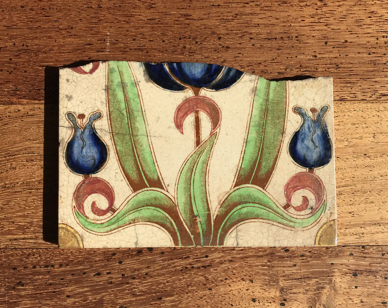
An antique tile that will help me to start gathering stimuli
Architectural photography tutorials
So yes, we did say 'don't get too hung up on the photography' BUT ... in case you wanted to, here are some tutorials ...
Readings, links, and helpful stuff
iPhone Photography School tips
Apple tutorials (if you have a fancy new phone)
These are a bit more intense ...
Exemplar