- Device
- Internet
- Printer
- Pens (different colours)
- Copy of the quick reference sheets
- Copy of the analysis task sheets
1
Introduction
The elements and principles of design are the building blocks of everything visual - everything that we can see can be described using the elements and principles of design (DE + P). It’s important to have a basic understanding of what they are and what they are for, before we begin to analyse and ‘unpack’ the works of other makers.
Equipment
Guiding Questions
Think about these questions as you work your way through the lesson:
Lesson Content
On one hand it’s important to understand WHAT the elements and principles are so you can DESCRIBE something that is visual (translating something visual into verbal communication).
Elements: aspect of something ‘colour’ - the cat has black and white stripes
On the other hand - understanding the DE + P helps us analyse and judge the QUALITY of designed outcomes.
Principles: how the elements relate to each other - the coloured stripes make a repeated pattern
In fields of design there are rules and practices around how to use the DE + P. Understanding what they are and HOW to apply them is vital - misuse can affect the information you are trying to communicate.
In the context of a limited edition print you’ll need to pay special attention to which elements have been used and how they relate to each other through the principles of design to create a successful composition.
Success in this context is simple: would someone think the print is cool/interesting enough to purchase and put on their wall? Taste and style are part of this consideration, but only part, because the maker still has to execute their ideas in a successful manner. That is an aspect that can be analysed more objectively.
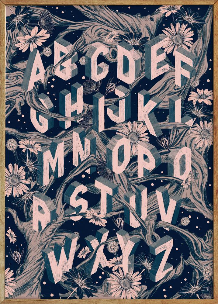
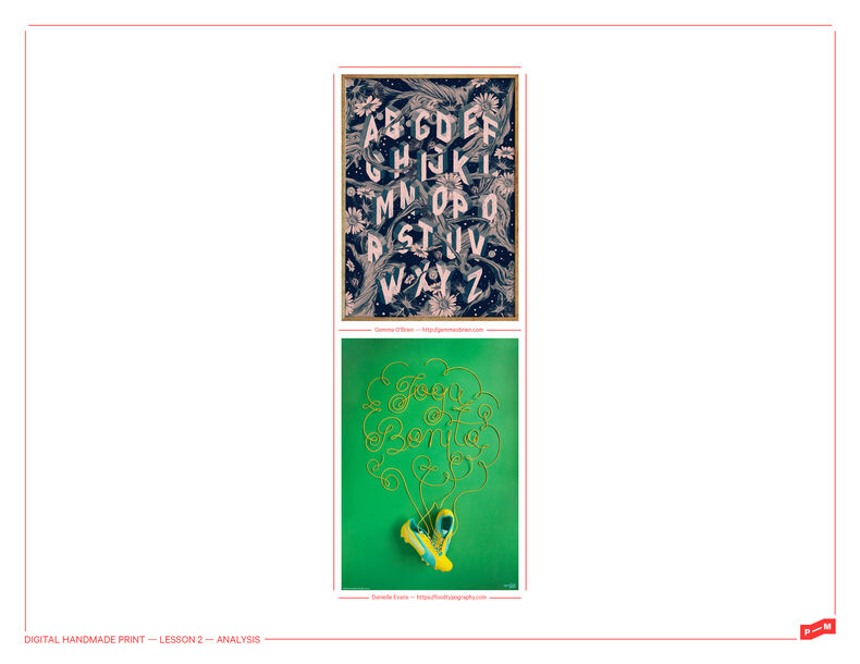
Gemma O'Brien
Most people notice when something is ‘badly’ designed, we’ve all seen a ‘bad’ website or poster. Interestingly people without training take things that are well designed for granted; you just like it and don’t realise that it is the result of a skilled designer. At this stage - we want you to start noticing the design elements in the world around you, and in the work of other makers.
It’s all about observation and identification followed by a series of critical questions such as; what has been used, why was it used, and what are the effects of those decisions?
Ultimately you have to know what they are if you’re going to actually use them, let alone use them to extend your ideas.
Remember to use the prompts below to make sure you really analyse the given examples. You should be able to use the Paper Leaf posters to identify and label the elements and principles easily enough. It's important to then extend yourself to ask why the designer has made those decisions and how you think it effects the work. Learning in design is about training yourself to observe the world in more detail and ask questions about what you see.
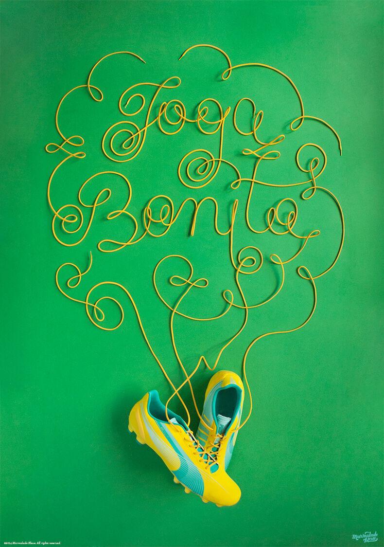
Food typography
Let's do something!
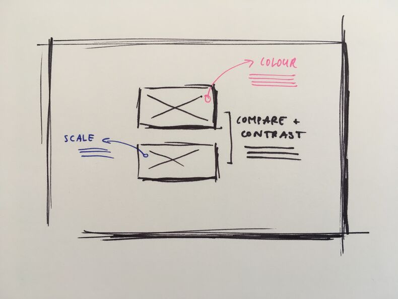
It doesn't have to be pretty!
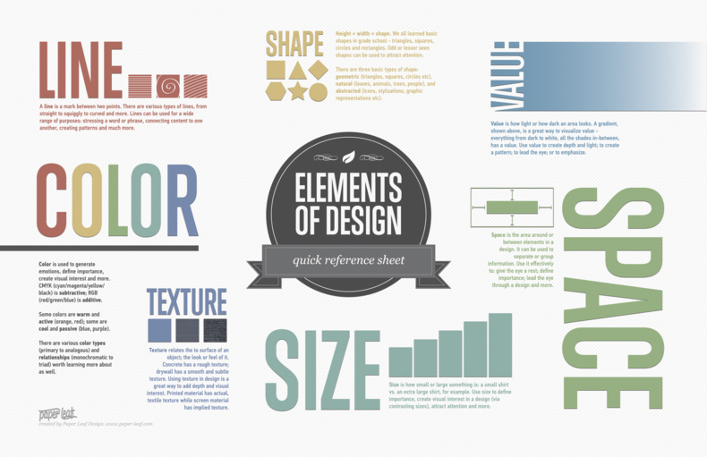
Paper Leaf's poster
Task sheet