Part A: about us
Despite being family, my mum and I grew up quite differently; she spent her early life in Manchester, England, and then moved to New Zealand in the 70s. I grew up solely in New Zealand (and often traveling back and forth to Malaysia) as a first-generation mixed-race person.
So, naturally, our creative and cultural heritages are quite different, as well as our relationship with wallpaper.
Mum recalls that in the late 60s, in her parents’ Stockport home, there was a separate dining room (for special occasions) with a feature wallpapered wall depicting a Scandinavian forest scene. Apparently that was “very fashionable at the time”. Fast forward 50 years, I grew up in the era of the block colour ‘feature wall’ and the concept of wallpaper seemed quite outdated to me. My now completely white-walled house was once a canvas for bad colour choices. The most memorable being a 90s vampire red wall around the fireplace and my own childhood bedroom a ghastly shade of buttery yellow (which I insisted on at age 5).
Mum’s creative story
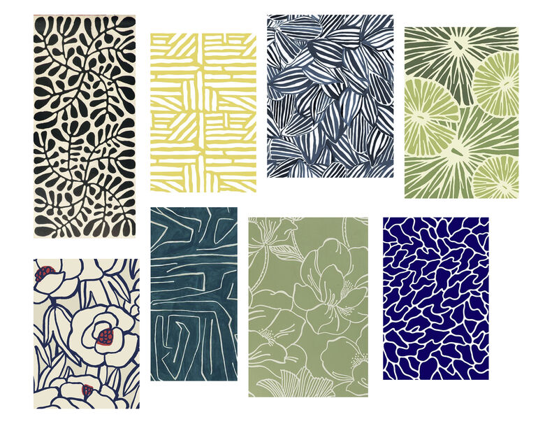
Mum started the wallpaper project first, reflecting on her memories of wallpaper design from her upbringing and emigration from working-class Northern England to Auckland in the 1970s. Being a landscape designer, mum has a keen interest and extensive knowledge of plants and gardens. Finding inspiration from walking around one of our local parks, mum decided to work with the motif of an oak tree, symbolising her heritage. The oak tree was an exotic tree brought to NZ by the colonial settlers. Using different parts of the tree (trunk, branch, and leaves) she began to re-create these organic shapes.
Mum wants her wallpaper to reflect her design style, referencing formal and naturalistic landscapes.
Mum utilises ‘serpentine lines’ which are typical in naturalistic landscapes which ‘guide you on a journey’ through the landscape.
My creative story
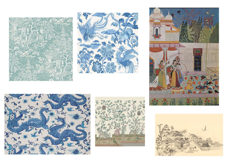
From my research, I rediscovered my love for Lisa Reihana’s ‘in Pursuit of Venus [infected]’ where she reimagined the classical french wallpaper ‘Les Sauvages de la Mer Pacifique’ into a moving image work. The original wallpaper was a response to the Wests’ fascination with Captain Cook’s ‘newly discovered’ pacific. Reihana’s take comments on colonialism and gives voice to unspoken historical narratives that were sugar-coated and overlooked in history and the original wallpaper. Since first seeing this work I was amazed at how eloquently Reihana was able to address this type of subject matter. So I decided to do a bit more research into historical wallpapers, making it more relevant to me.
I furthered my research by looking at historical and idealised views of Asia and began to plan how I could address these Orientalist views in my wallpaper.
More research
I am focusing on analysing and critically thinking about ‘chinoiserie’, a Western decorative art and design style which used Chinese and East Asian motifs heavily in wallpaper design. Most popular in the 18th century. To me, this style (due to its context) sits somewhere between cultural appropriation, and fascination. Typically this style would depict colonial-era Europe’s highly stylised perceptions of Asian culture and aesthetics. At the time, parts of Asian culture, or more rightly, the West’s fantasy of Asian culture were at the centre of this imagery. Further feeding to notions that Asia was to be viewed as ‘other’ in comparison to the dominant West.
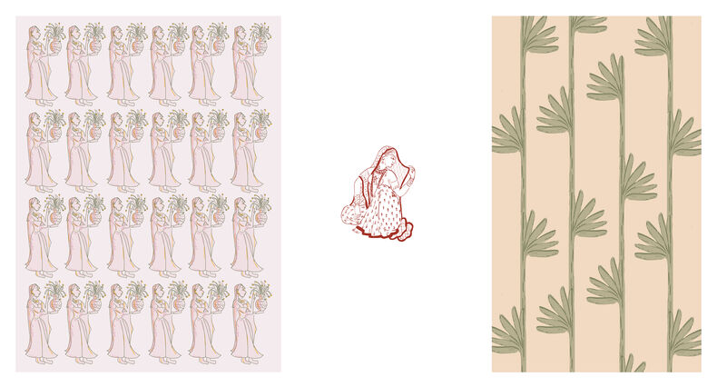
As a South Asian woman, I have the ability to explore a less exoticised and more neutral view of Asia and Asian aesthetics referencing elements of my own cultural heritage.
Part B: Starting to make
With the research and self-reflection out of the way, we now set on the second stage of the wallpaper project.
Mum had decided her wallpaper will be placed behind our TV and wrapping around the wall. This part of our lounge is bright and gets a lot of sun so it can handle a darker coloured wallpaper.
Mum started sketching out her oak leaf motifs by hand, testing multiple layouts, scales, and compositions.
Once she was happy with her layout she began working digitally in order to duplicate her shapes easily into an ongoing wallpaper pattern.

My variations
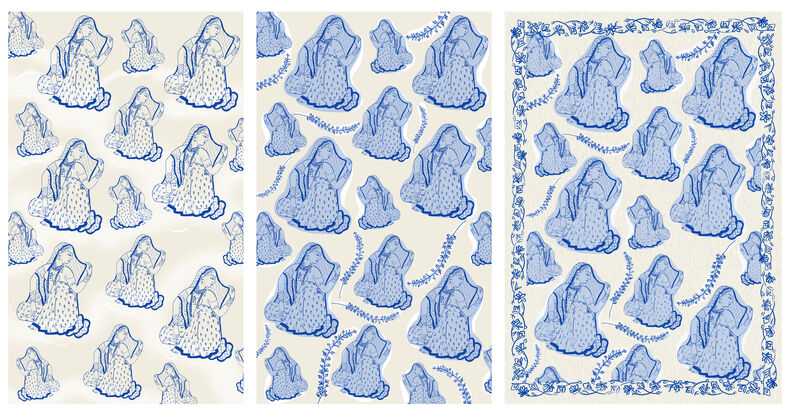
I decided that my wallpaper will be for the inside door or my bathroom. I chose this because it's a pretty blank canvas to work with. This would allow me to have fun with pattern and colour.
After I created some initial responses to my theme on my tablet which consist of pattern, colour, and shapes. I then focused on one drawing which I will expand tests with and explore further.
I figured out what I wanted my final wallpaper to look like pretty fast. Sticking firmly with blue and white (inspired by blue and white Chinese pottery), I focussed on generating several variations of my idea.
After this testing, I realised that the most successful and my favourite design was one of my first variations.
Mum’s tests
Mum went back to the drawing board and continued to play around with her oak leaf motif.
Her first test digitising her ideas didn’t work as planned- but it did let her know what was and wasn't working.
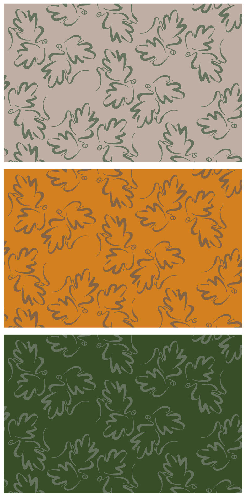
After a few more variations, mum finally decided on her pattern and set out to digitise it. She tested her design with different colour combinations until she decided on her final.
Mum’s final Wallpaper:
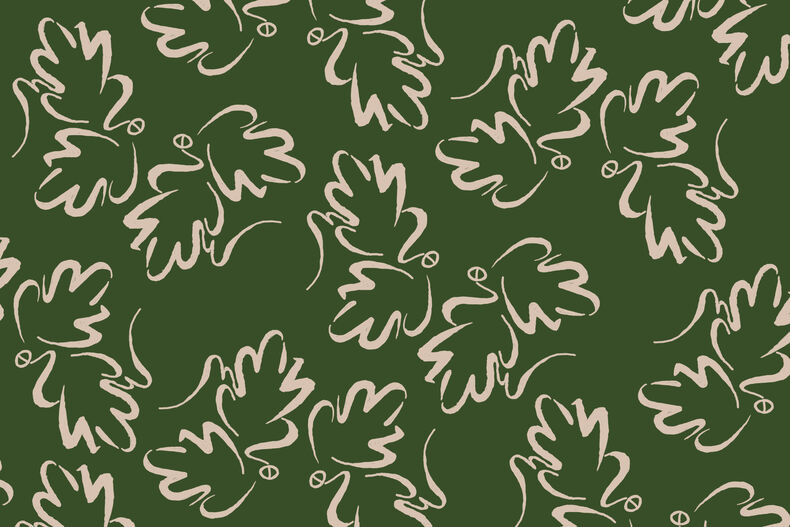
Here is Mum’s final wallpaper! I love the colour choice and think it fits her research and thinking behind it.
The repetition of the curved oak motif speaks of a more modern wallpaper design while the botanic theme adds a traditional element.
Mum’s final wallpaper
My final wallpaper
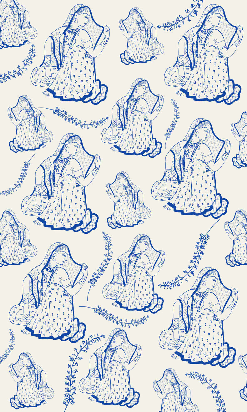
Here is my final wallpaper!
I’m pretty happy with the way my wallpaper turned out. Pattern and scale played a big role in making my wallpaper sing.
It was also good practice in restraint, as to not to make it overly busy and detailed.
I also think this is a really good mix of my personal aesthetic and my research. To me, it speaks to the history I read about as well as looking modern and on-brand to me.
My final wallpaper
Our wallpapered spaces
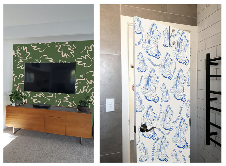
Here are our wallpapers looking cute in our chosen spaces!
Doing this project alongside my mum allowed me to understand her design process and aesthetic a bit better. Even though both outcomes are very different, I think we are both drawn to certain design elements (pattern and use of repeated shape). Mum learn a different way of digitising her hand-drawn work which could be helpful in her landscape design work. I really got into the contextual research for my project as the themes I explored are ones I want to continue to address through my work.
As always, I enjoyed making stuff with my mum and spending time with her - love ya mum!
