What even IS wallpaper?
Day 1: Hunting and gathering in my mind and at home.
Day 1 of the Wallpaper Project I started by thinking about what wallpaper is, what it might be and what it once was. I start by researching wallpaper through the ages, right back to handprints on cave walls to opulent aristocratic castles, classic villas in New Zealand and some current design magazines. Looking around me here the walls are painted, mainly shades of white with one wall in the bedroom charcoal grey.
The wallpaper I experienced intimately was in my childhood. I remember running my fingers over the textured stylised floral wallpaper in my bedroom.
My parents built our house in the late 70’s and the furnishings and decor were overwhelmingly patterned, with burnt orange and brown ruling the palette. Unsurprisingly the wallpaper has since been removed and walls painted in neutral colours. I’m all for colour in the home and where I usually live is painted in shades of mint and grass green. I didn’t paint it these colours, but I love living amongst the vibrant colours, it makes my artwork pop and gives the house a special character.
What should I do?
I asked myself: what would I want my walls to be papered in if I could do anything?
It’s important to me to feel connected with my surroundings and nature. Big windows and a view, preferably with lots of sky and if I’m super lucky some ocean, are what I want to see from my ideal home sanctuary. For most of us especially in urban environments this is not a reality. So maybe my wallpaper can give the feeling of spaciousness and looking out into nature, even if it’s on the wall of a tiny town apartment.
What can wallpaper offer today?
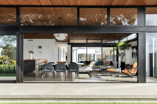
Wallpaper lends itself to texture, tone, and pattern. Paint can easily be mixed into all sorts of colours and even mixed with substances like sand or applied over plaster to give texture, but this is territory where wallpaper can come into its own. Traditionally wallpaper has offered a form of ornamentation or decoration for walls, often patterns have been dense, making a room look fussy and quick to date a house to a certain time period. Modern home decor often celebrates simplicity, being true to the materials used (not covering them up), with a feeling of openness and flow of one space into another, rather than a fixed space or room for eating, cooking, working, playing, relaxing, entertaining etc. Wallpaper today needs to reflect this flexibility of space usage and our less formal way of living.
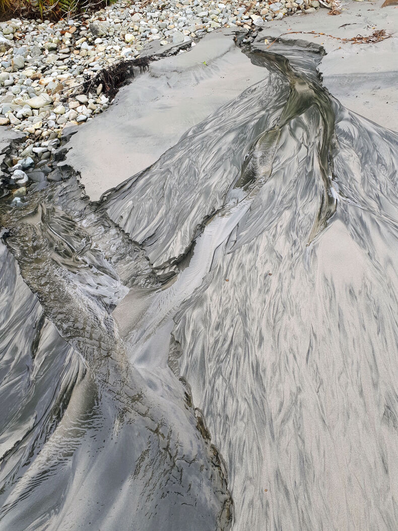
Image used: Urbis Magazine, by Samuel Hartnett
Artistic Intention
Day 2: Purpose and intent - hunting and gathering examples from my immediate environment and the virtual world.
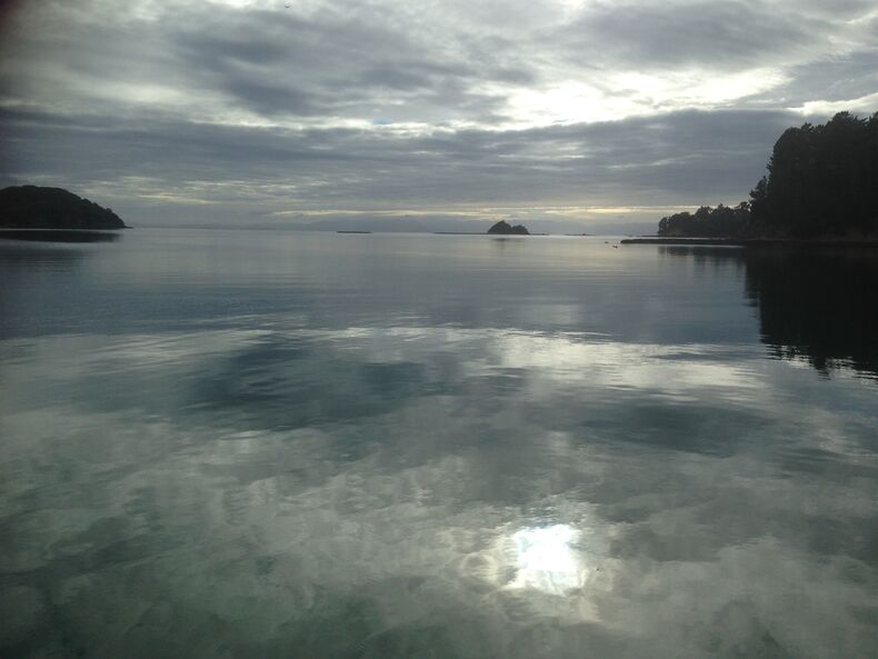
Now that I’ve thought about how I live and what my wallpaper might do for me, I’ve started having some ideas. I like staring at the sky and water. Imagine if I could have a wall that looks like it’s open to the sky...or looks out to the sea! Now we’re talking. I’m going to start taking photographs of the sea in different states, cloudy, sunset, late afternoon sun, rain coming.
Before starting I want to see what is already available in sky / sea wallpaper. There’s not much point making something that’s already in production. I search online and can only see postcard perfect sunsets, intense colours and lots of white fluffy clouds against perfect blue sky.
I want something muted and subtle, something I can live with and look at every day without getting tired of. It’s important that it creates an atmosphere in the room and tonal interest without having to be the centre of attention. I want to be able to hang artwork on the wall.
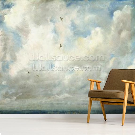
Image: Wallsauce.com-cloud study
Visualise and collect
Now I know what my wallpaper needs to do, I can start to visualise and collect images.
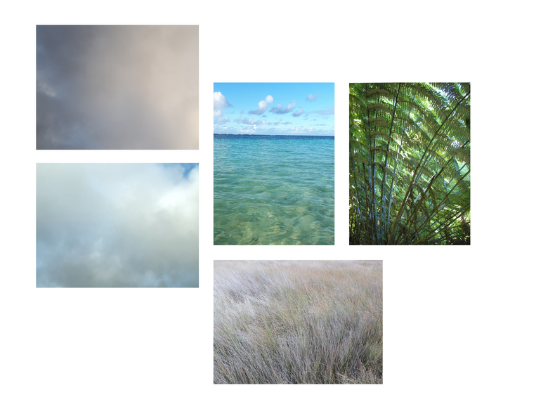
I go outside at various times of the day over the next few days and snap lots of photos of the sky. I also go through images on my computer as I have a history of taking way too many photos at the beach. I make a folder for ‘Project Make wallpaper project 2020’ and put them all in there.
I’m looking for soft tonal differences in nature so I select lots of cloudy day images and also put lots of sea photos in the folder, where the water isn’t too sparkly, again to have a more subtle tonal effect.
Creative Play
Day 3: Creative Play
My plan is to put filters on the photos to get different colours. Colour has a big impact on us and I want to use a variety of tones that will suit different interiors, rooms and tastes. I start using the photo editor on my phone, changing the tone and trying out different filters.
I soon decide the phone doesn’t give me the range of colour options or control over editing the photos so I save all the images into my ‘wallpaper’ folder on the computer and open the images I want to use in photoshop. You might have a different photo editing programme so this is your time to play around with effects on your photos.
I am liking my images but I want to play more with texture so I’m thinking about how I might add this in, in a way that fits with what I’m trying to achieve.
Ideation
Day 4: Ideation
Today it gets interesting. I’ve been reading about fractal geometry and how it occurs in cloud formations, waves, plants, our neural network....many many things. In the book I’m reading there’s also been studies that show our brains enter a relaxed state when we’re looking at these patterns, perhaps because our eyes processing the information also do it through a fractal network and we might recognise that we are part of a bigger whole by looking at these patterns. This is partly why I wanted to include cloud and ocean patterns in my wallpaper design but it’s also given me the idea to overlay geometric patterns to these images of the natural environment.
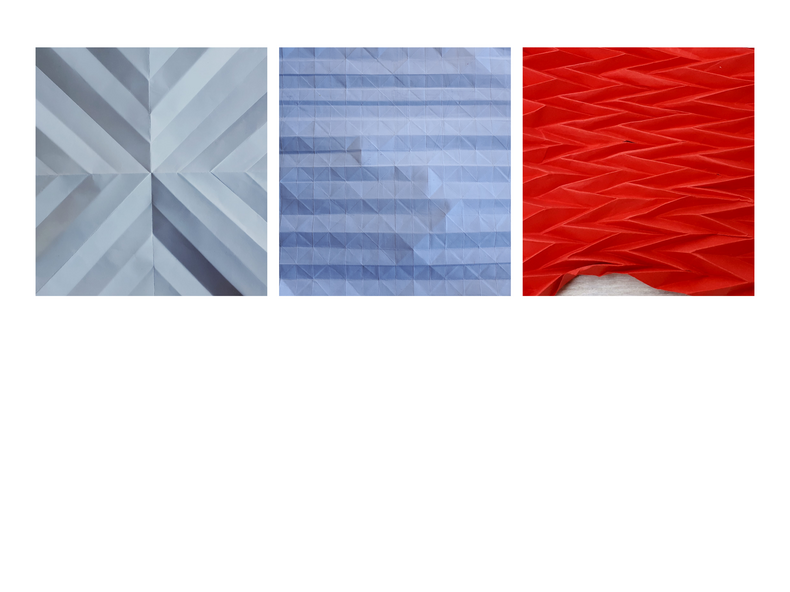
I start by drawing linear weaving patterns on paper and try adding some watercolour over the oil crayon for tonal variation. I like how the two mediums separate and I can get puddles of colour within my shapes.
To measure out the page I folded it to get a grid pattern. I like the folded effect better than my drawings so I start playing with different folding patterns. I get some patterns I like and try a couple of different types of paper. When I have some samples I like I take a few photographs of them and put these into the wallpaper folder on my computer.
Modelling and development
Day 5: Combining assets.
Today I’m going to try combining some of my sea and sky images with the folded geometric images over the top and see how they merge. I’m also going to try for a tonal colour range in each image, to give some idea of what a wallpaper selection might look like.
This is something I haven’t done before so I do some research online to find relevant tutorials and instructions. My photoshop is also quite an old version so it will take a bit of experimenting to see what I can do.
I’ve selected the image sets I want to blend after trying different combinations and now it’s time to play with filters, layers and colours to get tonal variations in each image set that I’m happy with.

Construction
Day 6: Digital Prototyping.
Next I wanted to select parts of my image to copy and mirror, widening the square image for my rectangle wall without distorting it too much. After I have some wallpaper designs ready to prototype, I check Resene’s website for custom printing image specifications. They take a variety of file types includes jpegs and tiffs.
Size: between 3-5 MB minimum, up to 500 MB maximum
Resolution: 300 dpi (converts to 118 ppi / pixels per inch)
I measure the wall I intend to use the wallpaper for: 376 cm wide x 225 cm high.
Then I upload my image to their website to check the result, I can print it out A4 to see how it’s looking. Unfortunately the site won’t finish the upload for me. I manage to get some sample images on wallsauce.com.
The furniture style doesn’t look right with most of my designs but it’s good to get an idea of how it would look on a wall.

Finito!
Post Script.
Woop! This project has made me way more comfortable using photoshop creatively. I learned how to combine images, play around with the colour and tones and use mirror imaging for interesting optical effects. I used my own photos to create cool wall art that looks geometric, 3D and evokes the natural environment all at once.
Tutorials and references:
Photoshop tutorial: moving images
Photoshop tutorial: basic iamge blending
Photoshop tutorial: mirror effect
Resene: wallprint generator
Wallsauce: mural generator
Wallsauce: cloud mural
Urbis Magazine: image source
